
Har du någonsin snubblat över en webbplats där du har kliat dig i huvudet, undrat var du ska klicka härnäst eller väntat i evigheter på att den ska laddas?
Tro mig, jag har också varit där, och låt mig säga dig att det inte är världens bästa känsla.
Här är sanningen om webbplatser som de aldrig har berättat för dig: Om din webbplats inte är användarvänlig, så stjäl du försäljning.
Den hemliga såsen till en användarvänlig webbplats ligger i de små detaljerna som tillsammans skapar en härlig användarupplevelse.
I det här blogginlägget kommer jag att berätta mer:
- Vad som gör en webbplats användarvänlig
- 10 viktiga och praktiska tips som hjälper dig att skapa en användarvänlig webbplats
Om du har funderat länge på hur du skapar en användarvänlig webbplats som imponerar på både besökare och sökmotorer har du kommit till rätt ställe. you’ve come to the right place.
Oavsett om du är en erfaren webbdesigner eller precis har börjat på denna spännande digitala resa, kommer dessa praktiska tips att vara dina pålitliga följeslagare på vägen mot en utmärkt webbplats.
Vad gör en webbplats användarvänlig?
När jag skulle skapa min egen webbplats var jag säker på en sak: jag ville att den skulle vara superanvändarvänlig.
För vad är det för mening med att ha en fantastisk webbplats om besökarna inte vet hur de ska använda den, eller hur?
Så vad är det egentligen som gör en webbplats användarvänlig?
Enkelt uttryckt är en användarvänlig webbplats som ett varmt välkomnande till ditt digitala hem - den är inbjudande, lätt att navigera och ger en sömlös upplevelse från det ögonblick någon landar på din sida.
Här är några viktiga saker som gör en webbplats användarvänlig:
- Intuitiv navigering: Se till att du har en välorganiserad meny med tydliga etiketter. Det gör det enkelt för dina besökare att hitta det de letar efter.
- Mobilvänlig: Vi är fastklistrade vid våra telefoner idag. Därför måste din webbplats se lika bra ut och fungera lika bra på mobila enheter som på stationära datorer.
- Responsiv design: Din webbplats bör anpassa sig till alla skärmstorlekar, som en kameleont som byter färg.
- Hastighet: För att snabba upp din webbplats ska du optimera bilder, använda cachning och överväga ett CDN-nätverk (Content Delivery Network) för att öka laddningstiderna.
- Engagerande innehåll: Detta är den magiska dryck som får besökarna att komma tillbaka för mer. Ingen gillar en textvägg som är svår att läsa. Håll det tydligt, koncist och strö in några fängslande bilder.
- Använd uppmaningar till handling (CTA): Se till att CTA:er sticker ut och använd ett handlingsorienterat språk.
- Tillgänglighet på webbplatsen: Det handlar om inkludering, min vän. Alla förtjänar att njuta av din webbplats, oavsett deras förmågor. Så lägg till alt-text i dina bilder och se till att tangentbordsnavigering fungerar.
Kort sagt är en användarvänlig webbplats som en välkoreograferad dans - den flyter smidigt och lämnar dina besökare med en känsla av att de har hittat precis det de söker.
Så skapar du en användarvänlig webbplats

Jättebra! Nu vet du vad som gör en webbplats användarvänlig.
Nu kavlar vi upp ärmarna och dyker rakt in i den saftiga delen - hur du kan göra din webbplats användarvänlig!
Jag har kokat ihop 10 praktiska och viktiga tips som kommer att göra underverk för din hemsidas användarvänlighet. Lita på mig, du behöver inte vara en teknisk trollkarl för att ta till dig dessa.
Här är 10 praktiska och viktiga tips som du kan använda för att göra din webbplats användarvänlig
Tips 1: Tydlig och intuitiv navigering
En tydlig och intuitiv navigering är ett måste om du vill att besökarna ska kunna utforska alla skrymslen och vrår på din webbplats utan att gå vilse.
- Välorganiserad meny: Detta hjälper besökare att hitta vad de behöver utan ansträngning, det är lätt att upptäcka och ännu lättare att använda.
- Kortfattade etiketter: Tänk dig att du går in i en butik och alla produkter är bara märkta "Produkt 1", "Produkt 2" och så vidare. Förvirrande, eller hur? Samma sak gäller för navigeringslänkarna på din webbplats. Använd beskrivande etiketter som talar om för dina besökare exakt vad de kan förvänta sig när de klickar.
- Använd rullgardinsmenyer: Om du har relaterade sidor, gruppera dem tillsammans för att hjälpa dina besökare att hitta relevant information på en gång, utan att hoppa från sida till sida. Använd rullgardinsmenyer för att dölja mer värdefull information som bara är ett klick bort.
- Använd brödsmulor på webbplatsen: Dessa fungerar som ett spår av digitala brödsmulor, visar dina besökare var de har varit och hjälper dem att spåra sina steg. Så om de befinner sig djupt nere i ditt bloggarkiv kommer brödsmulorna att leda dem tillbaka hem med ett leende.
- Lägg till sökfunktionalitet: Ibland vet besökarna exakt vad de vill ha, och de är på uppdrag för att hitta det pronto. Ett sökfält är deras trogna medhjälpare som hjälper dem att zooma till sin destination på nolltid.
Tips 2: Mobilvänlig design

Vi lever i en värld där alla har en smartphone fastklistrad i handen som om den vore en förlängning av dem själva.
Okej, kanske inte bokstavligen, men du fattar poängen - mobila enheter styr internetvärlden!
Så din webbplats måste lysa lika starkt på dessa små skärmar som den gör på en stationär dator.
Det handlar om responsiv design, där din webbplats magiskt anpassar sig till alla skärmstorlekar, oavsett om det är en gigantisk surfplatta eller en smartphone i fickformat.
Detta är viktigt - mycket viktigt!
En webbplats som ser ut som en enda röra på mobila enheter kommer att få dina besökare att springa snabbare än du kan säga "användarvänlig".
Ännu viktigare är att sökmotorerna också älskar webbplatser som behandlar sina mobila användare som kungligheter. Och när sökmotorerna är nöjda kommer de att belöna dig med bättre placeringar.
För att göra din webbplats mobilvänlig, se till att:
- Teckenstorleken är precis rätt - inte för liten så att besökarna behöver ett förstoringsglas, och inte för stor så att det känns som om de läser en barnbok.
- Du optimerar bilder så att de laddas snabbare än en nysning. Ingen gillar att stirra på en laddningsskärm, särskilt inte när man är på språng.
- Du gör knappar och länkar fingervänliga - Vi vet alla hur frustrerande det är att försöka trycka på en liten knapp med våra stora tummar.
- Du testar, testar, testar! Ta din smartphone, din väns smartphone eller din mormors smartphone - testa din webbplats på dem alla!
Tips 3: Snabba laddningstider

Känner du igen känslan när du klickar på en länk till en webbplats och det tar evigheter att ladda? Det är som att vänta på en långsam hiss - inte alls kul.
Låt oss se till att våra webbplatser inte ger våra besökare den där plågsamma väntan.
Först och främst kan långsamt laddande webbplatser vara en riktig glädjedödare för användarupplevelsen.
Jag menar, vem vill tillbringa sin dyrbara tid med att stirra på en laddningsskärm?
Långsamma webbplatser kan göra potentiella fans till snabba flyktkonstnärer som letar efter ett bättre och snabbare alternativ någon annanstans. Ouch, eller hur?
Men vänta lite, det finns mer att berätta.
Sökmotorerna, våra vänliga guider i den digitala världen, gillar inte heller långsamma webbplatser.
Japp, det stämmer - webbplatsens hastighet är en av de faktorer som de tar hänsyn till när de rankar sökresultat.
Så om du vill klättra i rankingen och bli stjärnan i sökmotorernas show är hastigheten ditt hemliga vapen.
Så hur kan vi få våra webbplatser att zooma som Flash?
Frukta inte, jag har några praktiska tips till dig.
Först ut är bilderna - de må vara snygga, men om de inte är optimerade kommer de att sakta ner din webbplats snabbare än en maratonlöpare med blyskor.
Komprimera bilderna utan att förlora kvalitet, så kommer din webbplats att tacka dig med snabbare laddningstider.
Säg sedan hej till cachning i webbläsaren. Det är som att spara godsaker i en kakburk för senare användning - förutom att det är din webbplats filer.
När någon besöker din webbplats för första gången lagrar deras webbläsare vissa filer så att webbplatsen laddas snabbare nästa gång de besöker den. Det är en win-win för alla!
Låt mig nu introducera dig till en fin akronym - CDN, eller Content Delivery Network. Det är som att ha din webbplats data lagrad på flera platser i världen.
När en besökare från ett annat hörn av världen dyker upp får de din webbplats data från en server i närheten, vilket resulterar i snabbare laddningstider. Det är som magi, fast bättre!
Och sist men inte minst, se till att koden på din webbplats är snygg. Ju renare kod, desto snabbare kommer din webbplats att fungera.
Så kavla upp ärmarna, optimera bilderna, utnyttja webbläsarens cachning, anamma ett CDN och städa upp koden.
Med dessa farthöjande knep i rockärmen kommer din webbplats att vara snabbare än en gepard på rullskridskor!
Dina besökare kommer att älska den snabba upplevelsen, och sökmotorerna kommer att ge dig tummen upp.
Tips 4: Läsbart och engagerande innehåll

Låt oss dyka ner i ordens magiska värld - den typ som fängslar och får våra besökare att komma tillbaka för mer.
Japp, vi pratar om läsvärt och engagerande innehåll, hjärtat och själen i en användarvänlig webbplats.
Så här ligger det till - när besökarna landar på våra webbplatser vill vi att de ska få en smidig läsupplevelse.
De ska inte behöva ta fram en ordbok eller kisa på skärmen som en detektiv som försöker knäcka en kod.
Tydligt och koncist innehåll är vad som gäller. Det är som att ha en vänlig chatt med dina besökare, minus jargongen.
Men vänta, läsbarhet handlar inte bara om själva orden - presentationen är också viktig!
Låt oss prata om typsnitt, mina vänner.
Välj läsbara typsnitt som inte kräver avkodningsförmåga.
Fancy kursiv stil kan vara snyggt på bröllopsinbjudningar, men på en webbplats vill vi hålla det enkelt och lättläst.
Låt oss nu ta itu med elefanten i rummet - teckenstorleken. Pyttesmå typsnitt är ett no-go - ingen vill leka kurragömma med bokstäverna.
Å andra sidan är gigantiska teckensnitt lika störande.
Hitta den perfekta storleken där texten är behagligt läsbar, som din favoritsaga i sängen.
Vitt utrymme - det är som en frisk fläkt för ditt innehåll. Var inte rädd för att ge dina ord lite utrymme att andas.
Tänk på det som pausen mellan musiknoterna, så att dina besökare kan ta till sig informationen utan att känna sig överväldigade.
Men vänta lite, vi är inte klara än! Låt oss höja nivån på vårt innehållsspel med visuella läckerheter.
Använd bilder som kompletterar ditt budskap som jordnötssmör och sylt.
Och hur är det med videor? Åh, de är engagemangets rockstjärnor!
Tänk dig att dina besökare klickar på play-knappen och sveps med av ditt fantastiska videoinnehåll. Det är som att sitta på första parkett till en oförglömlig show!
Och för de datahungriga besökarna är infografik rätt väg att gå.
Kondensera komplex information till visuellt tilltalande grafik, så kommer de att tacka dig för att du sparat deras hjärnceller lite hårt arbete.
Så kom ihåg detta - läsvärt och engagerande innehåll är den hemliga såsen som får din webbplats att lysa.
Tala direkt till din publik, håll det tydligt och koncist och strö över fängslande bilder.
Dina besökare kommer att fastna, och din webbplats kommer att bli den ultimata destinationen för härligt innehåll.
Tips 5: Använd uppmaningar till handling (CTA)

Har du någonsin hört talas om en CTA? Om inte så har du något att se fram emot!
CTA:er är som små superhjältar som guidar dina besökare mot de åtgärder du vill att de ska vidta.
Tänk dig följande - du har skapat en fantastisk webbplats med värdefullt innehåll och coola funktioner.
Nu vill du att dina besökare ska registrera sig för ditt nyhetsbrev, göra ett köp eller kanske ta kontakt. Det är där CTA kommer till undsättning!
En välplacerad CTA är som en vänlig vägvisare som pekar dina besökare i rätt riktning.
Det är en mild knuff, som uppmanar dem att vidta åtgärder utan att vara påträngande.
Kom ihåg att vi vill att vår webbplats ska vara en trevlig upplevelse, inte en oändlig försäljningspitch.
Så hur skapar vi CTA:er som fungerar som en charm?
Först och främst måste de sticka ut som en regnbåge på en grå himmel.
En ljus och kontrasterande färg gör susen - tänk neongrönt eller iögonfallande orange. Gör dem så oemotståndliga att dina besökare inte kan låta bli att klicka.
Nu ska vi prata språk.
Handlingsorienterat språk, för att vara exakt. Skippa det intetsägande "Klicka här" och välj något mer spännande som "Kom igång", "Var med på det roliga" eller "Upptäck magin". Dina besökare kommer att känna att de ger sig ut på ett spännande äventyr.
Men här kommer ett litet proffstips - se till att din CTA-text matchar den åtgärd som de utför. Om det är en CTA för registrering, använd ord som "Registrera mig" eller "Låt oss komma i kontakt".
Att anpassa texten till handlingen gör det kristallklart för dina besökare.
Och vart leder dessa fängslande CTA:er?
Ah, landet med relevanta landningssidor!
När dina besökare klickar på den lockande CTA:n vill de landa på en sida som håller vad den lovar.
Om det är en CTA för registrering, ta dem direkt till registreringssidan, inte till startsidan där de måste vandra runt som vilsna turister.
Men stanna inte där - strö CTA:er över hela din webbplats som konfetti. Varje sida bör ha ett syfte och en call-to-action som matchar.
Guida dina besökare steg för steg, som en vänlig reseguide som leder dem genom din virtuella värld.
Tips 6: Optimera webbplatsens formulär

Låt oss tala om en liten men mäktig del av våra webbplatser - formulär.
Jag vet vad du tänker - formulär är kanske inte den mest flashiga delen, men lita på mig, de kan göra stor skillnad när det gäller att skapa en användarvänlig webbplats.
Tänk dig följande - du har besökare som är intresserade av vad du erbjuder och som är redo att registrera sig, ta kontakt eller till och med göra ett köp.
Men vänta, ditt formulär ser ut som ett oändligt frågeformulär, och de undrar om det är värt deras tid.
Uh-oh, det är inte den upplevelsen vi vill ha, eller hur?
Användarvänliga formulär är som välkomnande leenden som uppmuntrar dina besökare att vidta åtgärder.
När dina formulär är enkla att fylla i kommer du att se magin hända - fler leads och konverteringar på väg mot dig.
Det viktigaste först, låt oss hålla det enkelt.
Ingen har tid med långa formulär där man frågar efter varje detalj under solen.
Så ta ner det till det väsentliga. Be om den information du verkligen behöver, som namn, e-postadress och kanske ett litet meddelande om det behövs. Håll det kort, koncist och rakt på sak.
Låt oss nu prata om de ökända "obligatoriska fälten".
Du vet, de där små asteriskerna som gör att det känns som ett jobb att fylla i formulär.
Var snäll mot dina besökare - markera bara fält som obligatoriska om det är absolut nödvändigt. Vi vill göra deras resa så smidig som smör, inte en skumpig resa.
Och här är ett bra knep för att underlätta för dem - användbara felmeddelanden. Vi gör alla misstag, och det är okej!
Om dina besökare glömmer att fylla i ett obligatoriskt fält eller gör ett stavfel, vägled dem försiktigt med vänliga felmeddelanden.
Istället för "ERROR - INVALID INPUT" kan du prova något i stil med "Oops! Det ser ut som om du missade ett obligatoriskt fält. Vänligen fyll i det så att vi kan hålla kontakten."
Du förstår, webbformulär är inte bara lådor som ska fyllas i; de är konversationer som väntar på att hända.
Så låt oss se till att våra formulär är användarvänliga chattkompisar, inte skrämmande förhörsledare.
Nu kanske du undrar: "Hur vet jag om mina formulär gör sitt jobb?" Svaret ligger i testning.
Ta på dig detektivhatten och genomför några användbarhetstester.
Be dina vänner, din familj eller till och med din papegoja att testa dina formulär. Samla in feedback, gör förbättringar och se dina konverteringar skjuta i höjden!
Tips 7: Säkerställ webbplatsens tillgänglighet
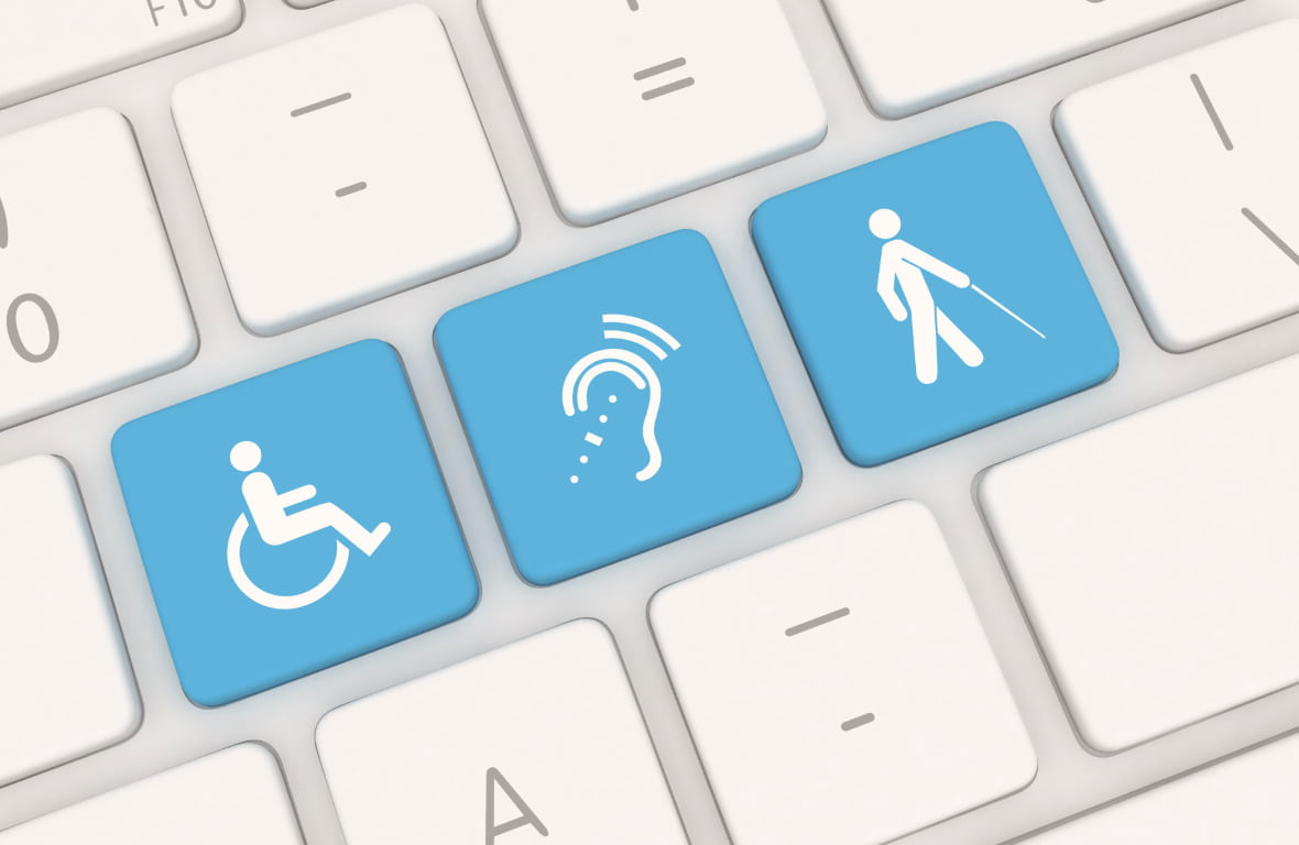
Idag ska vi rikta strålkastarljuset mot ett ämne som ligger mig varmt om hjärtat - webbplatstillgänglighet.
Så - du har ägnat otaliga timmar åt att göra din webbplats perfekt, och du vill att alla ska kunna njuta av det fantastiska, eller hur?
Ja, det är där tillgänglighet kommer in i bilden för att se till att alla användare, oavsett förmåga, kan uppleva din webbplats utan problem.
Att skapa en inkluderande webbplats är att få alla att känna sig välkomna och inbjudna.
När vi designar med tillgänglighet i åtanke ser vi till att personer med funktionsnedsättning kan navigera och interagera med våra webbplatser precis som alla andra.
En viktig funktion är alt-text för bilder.
När någon med synnedsättning använder en skärmläsare fungerar alt-texten som deras ögon och beskriver bilderna för dem.
Så se till att lägga till beskrivande alt-text till dina bilder.
Nästa punkt är tangentbordsnavigering - superhjälten inom webbplatstillgänglighet!
Vissa användare kanske förlitar sig på tangentbord istället för mus för att navigera.
Låt oss se till att de kan nå varje hörn av vår webbplats med sina pålitliga tangentbordspilar, precis som du och jag gör med våra möss.
Och här är ett smart trick - hoppa över länkar!
Dessa små pärlor gör att skärmläsaranvändare kan hoppa över repetitivt innehåll och hoppa direkt till de viktigaste delarna av din webbplats. Det är som att erbjuda dem en genväg till det bästa.
Låt oss nu prata om kompatibilitet med skärmläsare.
Skärmläsare översätter innehållet på din webbplats till tal eller punktskrift för personer med nedsatt syn.
Se därför till att din webbplats är optimerad för att fungera smidigt med populära program för skärmläsare.
Men vänta, det finns mer!
Färgkontrast är avgörande för personer med nedsatt syn eller färgblindhet.
Se till att text och bakgrundsfärger har tillräcklig kontrast för att göra läsningen enkel, som svarta och vita tangenter på ett piano.
Och glöm inte bort videoinnehåll - lägg till bildtexter och transkriptioner så att alla kan följa med, oavsett hörselförmåga.
Kom ihåg att webbtillgänglighet inte bara är ett lagkrav, det är ett moraliskt ansvar att skapa en digital värld där alla kan delta.
Så ta med alternativ text, anamma tangentbordsnavigering, erbjud länkar att hoppa över och säkerställ kompatibilitet med skärmläsare.
På så sätt bygger vi en webbplats som välkomnar alla med öppna armar.
Tips 8: Testa och samla in feedback
Det finns en duo som kan ta dina användarvänliga webbplatser till nästa nivå - testning och insamling av feedback.
Det är lätt att gå vilse i sin egen webbdesignvärld, men om vi vill skapa en webbplats som verkligen rockar måste vi lyssna på våra besökare.
Genom att testa och samla in feedback kan du se med dina användares ögon.
När du genomför användbarhetstester ser du hur riktiga användare interagerar med din webbplats.
Det är som att se sin skapelse komma till liv, och man får direkt se vad som fungerar och vad som behöver justeras lite.
Tänk dig följande - du har gjort i ordning din webbplats, men du är inte säker på om dina besökare har en trevlig upplevelse eller sliter sitt hår av frustration.
Det är här användbarhetstestning kommer in för att rädda dagen.
Bjud in riktiga användare att utforska din webbplats och observera hur de navigerar, vad de klickar på och var de eventuellt snubblar.
Men det är inte allt - att samla in feedback är som att ha en grupp betrodda rådgivare vid din sida.
Dina användare har värdefulla insikter och perspektiv som du kanske inte har tänkt på.
Så var inte blyg - be om deras feedback genom enkäter, feedbackformulär eller till och med gammal hederlig e-post.
Här är ett smart trick för dig - A/B-testning. Det är som ett vetenskapligt experiment för din webbplats.
Skapa två versioner av en sida, justera ett element och se vilken version som fungerar bättre.
På så sätt får du ditt eget digitala laboratorium där du kan finjustera din webbplats för maximal användarvänlighet.
Och här är en annan superkraft - heatmaps. De visar dig exakt var dina besökare klickar, scrollar och spenderar sin tid.
Det är som att ha röntgenblick för att se de heta och de mindre heta punkterna på din webbplats.
Med hjälp av heatmaps kan du identifiera förbättringsområden och fatta datadrivna beslut.
Kom ihåg att dina webbplatser inte bara är till för dig - de är till för dina besökare.
Genom att testa och samla in feedback sätter du dig in i deras situation och lär dig hur du kan göra deras upplevelse extraordinär.
Så gör användbarhetstester, lyssna på dina användares feedback, experimentera med A/B-testning och utforska heatmaps som de äventyrliga webbkreatörer du är.
På så sätt kommer du att bygga användarvänliga webbplatser som dina besökare kommer att älska och uppskatta.
Tips 9: Uppdatera och underhåll webbplatsen regelbundet
Vi har lagt ner så mycket kärlek och möda på att skapa våra användarvänliga webbplatser, men resan tar inte slut där.
För att dina webbplatser ska fungera som väloljade maskiner måste du ta till dig kraften i regelbundna uppdateringar och underhåll.
Tänk dig - du har byggt en fantastisk webbplats, men du har inte rört den på evigheter.
Samtidigt utvecklas den digitala världen snabbare än en kula.
Ny teknik dyker upp, säkerhetshot lurar i skuggorna och användarnas förväntningar svävar högre än skyskrapor.
För att hålla jämna steg med tiden och behålla din användarvänliga charm är uppdateringar dina bästa vänner.
Först och främst är färskt innehåll hjärtat på en blomstrande webbplats.
När besökare kommer tillbaka för att få mer, förväntar de sig att se något nytt och spännande.
Oavsett om det handlar om blogginlägg, produktuppdateringar eller meddelanden visar du genom att regelbundet uppdatera ditt innehåll dina besökare att du alltid är redo att ge dem det bästa.
Men vänta lite, det handlar om mer än bara innehållsuppdateringar.
Säkerhetspatchar och programuppdateringar skyddar våra webbplatser från skurkar (även kallade hackare och buggar).
Onlinevärlden kan vara en vild plats, och vi måste hålla vår webbplats stark med det senaste försvaret.
Låt oss nu prata om regelbundet underhåll.
Du kanske tror att dina webbplatser är oförstörbara, men även de mäktigaste av webbplatser behöver lite TLC (*Tender Loving Care*).
Genom att implementera ett underhållsschema säkerställer du att allt går som smort.
Leta efter brutna länkar, åtgärda eventuella fel och rensa upp bland allt skräp som kan ha samlats.
Och här är ett tips – skapa en checklista för dina underhållsuppgifter. Detta blir som en vägkarta som guidar dig genom underhållsresan. Bocka av varje punkt som i ett videospel, så kommer din webbplats att tacka dig med förstklassig prestanda.
Kom ihåg att dina webbplatser är som levande varelser i den digitala världen.
De behöver kärlek, omsorg och lite uppmärksamhet då och då.
Genom att regelbundet uppdatera och underhålla dina webbplatser ser du till att de förblir relevanta, säkra och användarvänliga.
Ta vara på kraften i uppdateringar, håll ditt innehåll aktuellt och skydda dina webbplatser med säkerhetspatchar och programuppdateringar.
Dessutom kan du skapa ett underhållsschema med vår ultimata checklista som den ansvarsfulla webbplatsägare du är.
Med hjälp av dessa kan du bygga användarvänliga webbplatser som står sig över tid.
Tips 10: Analysera webbplatsens prestanda

När vi närmar oss slutet av denna blogg om att skapa användarvänliga webbplatser finns det en sista superhjälte vi måste möta - webbanalys!
Jag vet vad du tänker - analys kan låta som en komplicerad term, men lita på mig, det kommer att bli ditt hemliga vapen för att låsa upp den verkliga potentialen på din webbplats.
Så nu när du har lagt ner ditt hjärta på att skapa en användarvänlig webbplats vill du veta hur dina besökare interagerar med den.
Utforskar de varje skrymsle och vrå, eller fastnar de på vissa sidor? Det är där webbanalys kommer in för att rädda dagen.
Webbanalys hjälper oss att förstå användarnas beteende. Det ger oss insikter om vad som fungerar och vad som behöver lite omvårdnad.
Med denna värdefulla information kan vi fatta datadrivna beslut för att förbättra webbplatsens prestanda.
Nu ska vi prata om ett fantastiskt verktyg som du kanske har hört talas om - Google Analytics! Det analyserar din webbplats data som ett proffs.
Med Google Analytics får du veta varifrån dina besökare kommer, vad de klickar på och till och med hur länge de stannar på din webbplats.
Här är ett smart trick - sätt upp mål i Google Analytics för att få ditt alldeles egna superhjälteuppdrag.
Det innebär att du definierar vilka åtgärder du vill att dina besökare ska vidta - oavsett om det handlar om att registrera sig för ett nyhetsbrev, göra ett köp eller fylla i ett kontaktformulär.
Låt sedan Google Analytics följa utvecklingen av dina uppdrag och visa dig hur väl du lyckas med dem.
Men vänta, det finns mer!
Konverteringsspårning är en annan superkraft i Google Analytics.
Den visar dig exakt vilka vägar dina besökare tar innan de konverterar till kunder eller prenumeranter. Detta gör att du kan förstå vad som övertygar dina besökare att vidta åtgärder.
Kom ihåg att webbanalys inte bara handlar om siffror och diagram - det handlar om att förstå dina besökare på en djupare nivå.
Med den kunskapen kan du finjustera din användarvänliga webbplats för att tillgodose deras behov och preferenser.
Så omfamna kraften i webbanalys, bli bekant med Google Analytics, sätt upp mål som superhjälteuppdrag och spåra konverteringar som skattjägare.
Med webbanalys på din sida kommer du att skapa en användarvänlig webbplats som fängslar dina besökare och får dem att komma tillbaka för mer.
För att sammanfatta
Och där har du det - 10 viktiga tips för att skapa användarvänlighet på din webbplats!
Nu har du verktygen och kunskaperna för att skapa webbplatser som lämnar ett bestående intryck på dina besökare.
Från att förstå vad som gör en webbplats användarvänlig till att optimera navigering, omfamna mobilvänlig design och säkerställa blixtsnabba laddningstider, vi har täckt allt.
Vi har också dykt ner i världen av engagerande innehåll, fängslande CTA:er och vikten av webbplatstillgänglighet.
Men ditt arbete slutar inte här - åh nej!
Nu är det dags att omsätta tipsen i praktiken och se din webbplats förvandlas till ett användarvänligt mästerverk.
Kom ihåg att du har makten att skapa en webbplats som välkomnar alla med öppna armar.
Dina besökare kommer att glida genom din välorganiserade navigering, njuta av ditt engagerande innehåll och vidta åtgärder med dina övertygande CTA.
Din mobilvänliga design är anpassad för besökare på språng, och dina snabba laddningstider kommer att göra dem imponerade.
Men vänta lite - det handlar inte bara om att imponera på dina besökare.
Genom att integrera webbplatsens tillgänglighet ser du till att alla, oavsett förmåga, kan uppleva det underbara med din webbplats.
Och glöm inte hur viktigt det är att hålla din webbplats uppdaterad och underhålla den regelbundet med vår **Ultimata checklista för regelbundet underhåll av webbplatsuppdateringar!**
Färskt innehåll, säkerhetsuppdateringar och smidig funktionalitet gör att dina besökare kommer tillbaka för mer.
Men ta inte mitt ord för det - låt webbanalysen visa dig vägen.
Förstå dina besökare, fatta datadrivna beslut och frigör den verkliga potentialen hos din användarvänliga webbplats.
Så vad väntar du på?
Ta till dig dessa tips och gör din webbplats användarvänlig. På så sätt förbättrar du användarupplevelsen, uppnår dina affärsmål och ser din närvaro på nätet nå nya höjder.
Må din användarvänliga webbplats lysa starkt i det stora onlineuniversumet.
Lycka till med att skapa webbplatser, mina vänner!
Laila


")